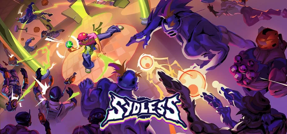
Sydless : Why Does the Game Look Like … This?
Why Does the Game Look Like … This?
Hello everyone – and welcome to this week’s Steam post!
A few weeks ago, PirateSoftware played our game on stream (full video
) and, at some point, said that “this is probably […] one of the most interesting directions I’ve seen of a shooter game”. So today, we’ll be talking a little more about just that!
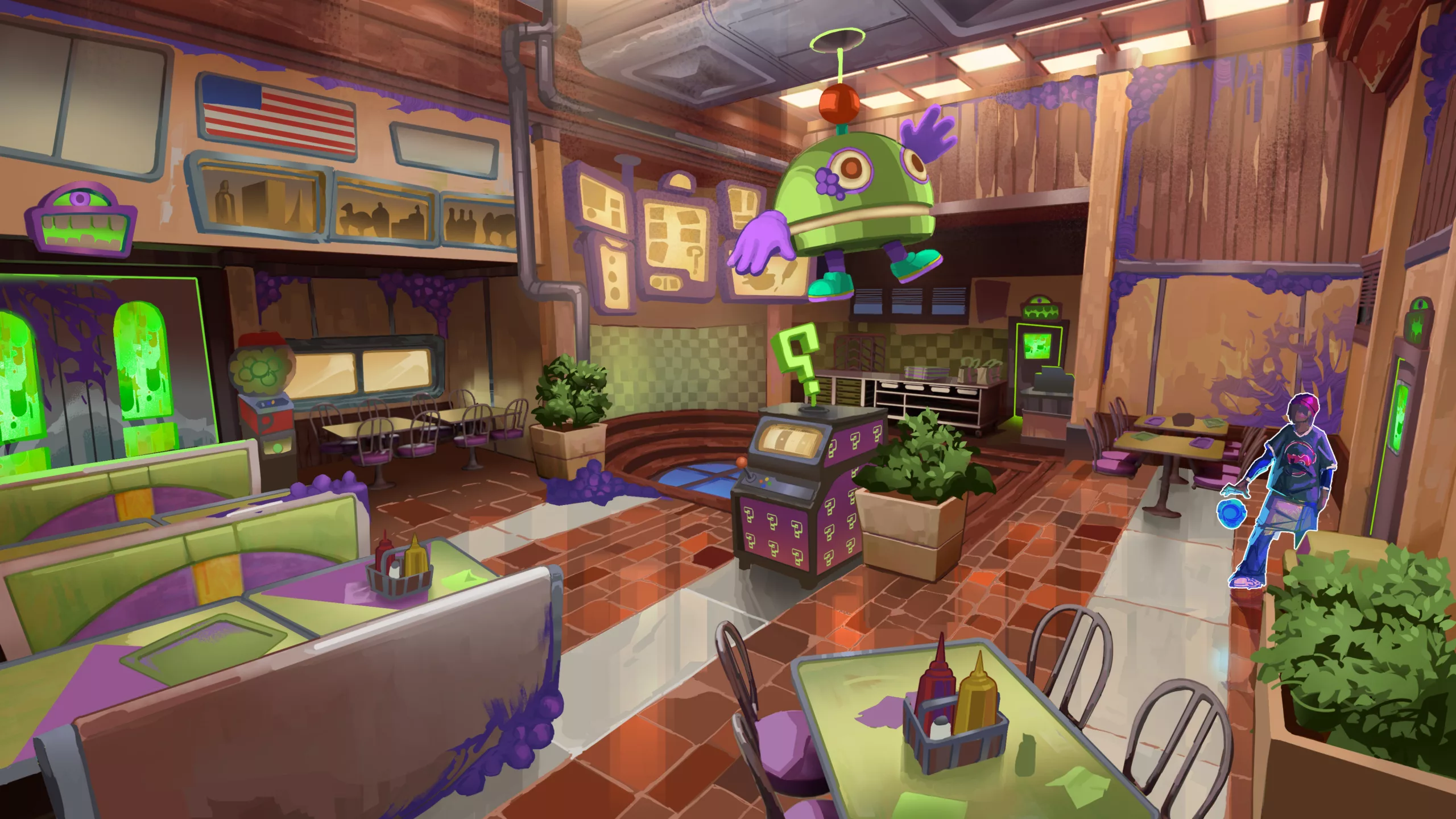
From the very beginning, we were drawn to strange, unsettling universes where things don’t fully explain themselves – SCP, backrooms, this kind of stuff. Spaces that feel familiar at first glance, but wrong once you spend a little more time in them.
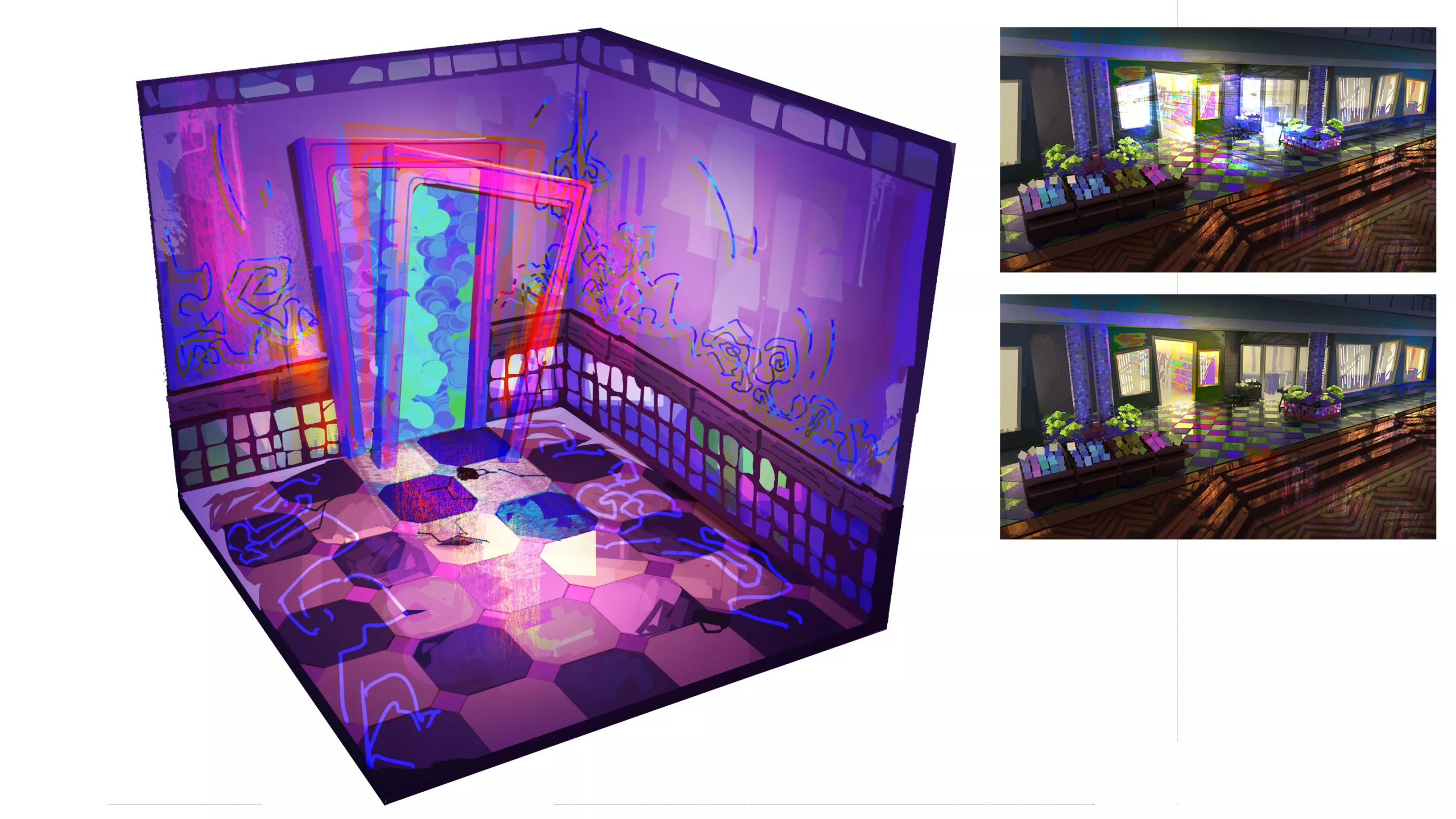
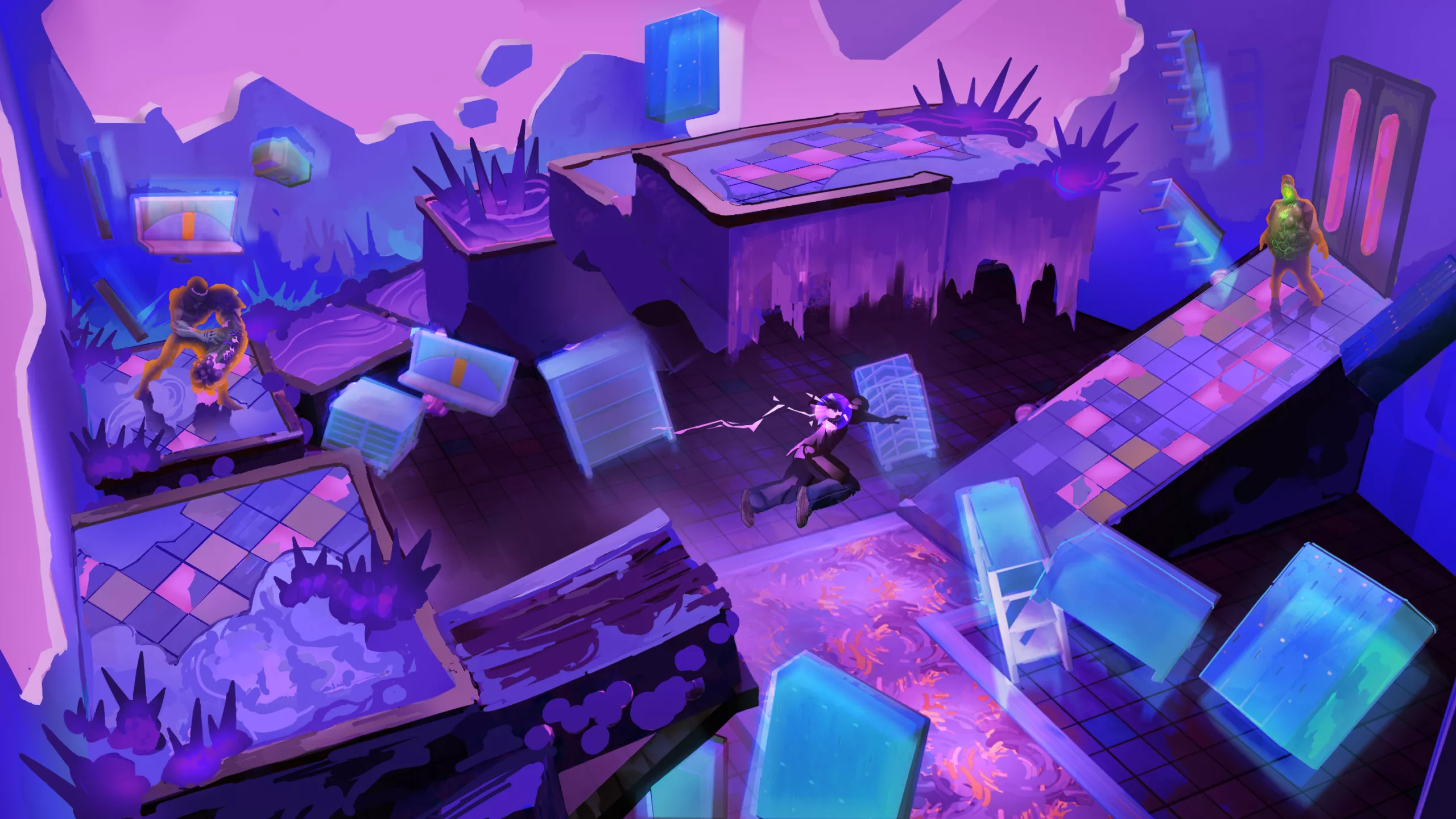
Visually, we wanted that anomaly to feel invasive, not just something you observe, but something that spreads. As you progress, spaces become more labyrinthic and rooms repeat, stretch – the environment starts to push back. The goal isn’t to confuse for the sake of confusion, but to make the player feel a growing loss of control and certainty, directly materialized by the surrounding environment.
The fast-food setting gave us a strong foundation to build on as these kinds of places come with very rigid and easily recognizable graphic codes – furniture, signage, mascots, kitchens, dining areas, menus, … As these are all designed to be instantly readable and endlessly repeatable, we had a lot of room to remix these elements, distort and exaggerate them, all while keeping a consistent visual language throughout the game.
Stylistically, we leaned heavily toward a colorful, stylized look. We are big fans of hand-painted art directions with rich textures and bold shares, and we felt that this vibrancy was the right contrast to the bleak background of the anomaly-wrapped fast-food. The intensity of the colors is here to amplify what Diego is going through: everything is loud, saturated, expressive, almost overwhelming, which mirrors the emotional overload of the situation – and the gameplay for that matter.
To push this even further, we chose to anchor the game at the end of the 90s as that era has a specific aesthetic that has recently made a popular comeback. More importantly, it was also a time where design – especially in commercial spaces – was unapologetically bold. Restaurants, objects, mascots, … all experimented a lot back then (the sans serif prohibition amirite?!), which gave us huge freedom when designing the environments, props, and characters.
All in all, we wanted our art direction to feel mysterious, colorful, intense, stylized, labyrinthine (if not overwhelming), 90s-coded, all within the context of a fast-food restaurant!
That’s all for today! As always, the demo is still available if you want to experience it firsthand. We’re also quite active on our socials, so come say hi:
Talk to you soon!